Did you know that where you place your buttons affects how fast users complete their task? Quicker task completion results in a more satisfying experience. If this is what you want, you have to place your buttons where users expect to find them.
Here’s a comprehensive analysis of all the button placements you could use. Learn which button placement is the optimal one for your app, so users don’t waste their time.
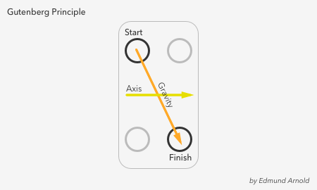
Before users can take action, they have to scan the screen. The screen content informs their decision on which action to take. As soon as they finish scanning, the call to action should present itself. Where do their eyes end up when they finish?
It turns out they start at the top left corner and finish in the bottom right, moving their eyes in a zig-zag. Renown newspaper designer Edmund Arnold called this natural scanning pattern the Gutenberg Principle.
The principle illustrates how the eye moves from left to right along an axis of orientation until it reaches the bottom right corner. It forms a prominent scanning path called reading gravity. Design elements that lie along the diagonal get the most attention. Elements that lie outside it receive less.
Optimal button placement follows the Gutenberg Principle. You should place your buttons at the end of the user’s scanning path when they’re ready to take action. There are rare cases when users are ready to take action before scanning, but this is only when they’re already familiar with the screen content.
The first location to decide on is whether to place your call to action button at the top or bottom of the screen. Which button placement follows the Gutenberg Principle?
Most users start by scan the content first because it relates to their task and dominates the screen. Their eyes move from the top half of the screen towards the bottom. When the content ends, they’re looking for a call to action.
Their eyes remain at the bottom as they’re searching for a button until they can’t find one. That’s when they scramble their eyes to the top of the screen and stumble upon it in the top right corner.
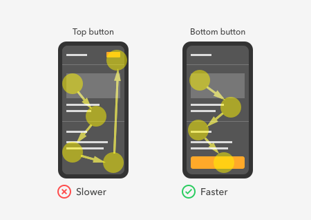
Placing the call to action button at the top confuses users because they expect to see it after they finish scanning the content. A top button placement goes against their natural scanning flow and veers them away from the path of completion.
Not only that, but a top button is also smaller than a bottom button because it has to share space with the screen title. The small size combined with the awkward placement makes top buttons harder to find and slower to tap.
When you place your call to action button at the bottom, users can get to it faster. They would see the button right after scanning the content using no excess eye movement. A bottom button is not only in alignment with the Gutenberg Principle, but it’s also bigger and easier to reach.
The only time a top button makes sense is when users select an item on the screen. For example, when a user selects a table row, the app bar changes and provides relevant actions for the selected item. The screen title disappears, and the number of selected items appears.

Top buttons also apply to selecting image content. Using top buttons in this context allows users to take action faster after they notice the state change in the app bar. The proximity of the buttons to the status title means the user’s eyes don’t have to stray far.

There are a few ways you can arrange your buttons at the bottom. One way is to align them side-by-side horizontally. This arrangement is ideal when you want to emphasize the relationship between two different actions. It causes users to view them as a set and give equal consideration to both.

In the example, the app uses horizontal buttons to ensure users know they can edit the design of their shoes before they buy them. The side-by-side placement reinforces the relationship between both actions.
Since buying the shoe and editing the design are equally important for customer satisfaction, they’re paired together like siblings. This way, users won’t overlook the “Edit design” button if they’re in a rush to buy.
You have the choice to place your primary action on the left or right for horizontal buttons. But which placement allows users to take action faster?

When the primary action is on the left, it works against reading gravity. The user’s eyes want to move toward the bottom right, but the visual weight of the button keeps them fixated on the bottom left. After the fixation, they move to the bottom right only to revert to the left to tap the main button. As a result, the user’s eyes sweep back and forth sweep, increasing the user’s task time.
When the primary action is on the right, the result is faster task completion because the button is where the reading gravity ends. Users don’t have to reverse their scanning flow or fixate on the primary action more than once.
Another way you can arrange your buttons is to stack them vertically. This arrangement is ideal if you want users to focus on each action separately. You’ll get them to fixate longer on each button for more careful consideration.

Vertical buttons are more prominent than horizontal buttons because they have more space to span the width of the screen. The larger size not only makes the buttons easier to tap, but it gives the primary action the most visibility.
In the example, the primary action is the “Add to cart” button, which is more important than the “Add gift message” button. Arranging it as a vertical button emphasizes it, so the secondary action isn’t competing.
Should the primary action go on top or bottom? The Gutenberg Principle dictates that reading gravity flows in a downward direction. A bottom button allows users to get to it faster by only scanning downward. When it’s at the top, users have to scan downward and then upward to tap it.

The last button arrangement is a hybrid of horizontal and vertical buttons. Use this approach if you have at least three buttons.
Three buttons take users longer to decide because there is more information to process. But this arrangement cuts their decision time with its visual hierarchy. Instead of relying on the labels every time, users can recall each action by looking at the button’s size and orientation cues.

In the example, the primary action is the big green button. It’s easy to spot because there are no other buttons of the same size or color. The user can then associate one action as the leftmost button and the other action as the rightmost button.
The more often users tap the buttons, they learn which action is which by its size and orientation. Soon they’ll develop a habit that helps them take action without thinking.
Reading gravity dictates that the primary action goes at the bottom and the secondary actions go above it. The higher priority button needs the most attention and should go at the end of the user’s scanning flow.

The secondary actions shouldn’t have a distinct color, or it’ll compete with the primary action. Instead, they both should have a neutral color with either an outlined or light shaded button style.
You don’t have to align them flush with the vertical button. Aligning them offset with the vertical edges emphasizes their left and right orientation.
A technique to make the call to action visible to users at all times is to use sticky buttons. The buttons stay fixed to the bottom of the screen, allowing users to take action wherever they scroll.

Use these sticky buttons to your favor on native apps, but avoid them for browser-based web apps. Sticky buttons on web apps cause tapping issues because of the browser bar popping up when users target the button.
There are workarounds for this issue, but they are complicated. The most natural solution is to add extra padding between the button and the browser bar.
The call to action button is the user’s last step to success. Where you place it can make their task faster or slower. Make it effortless to get to by placing it in alignment with the Gutenberg Principle. When you do, your call to action button will have an optimal placement that goes with the flow.